[v3.4 Preview] Mobile-Friendly Forms!
Hi folks! 😀 During the last few months, we’ve been working hard to add a bunch of new features into MachForm and I would like to share one of the new feature we’ve been working on.
As you might aware already, most people nowadays aren’t just using the desktop computer to browse websites. Mobile devices, such as the iPhone, iPad or Android devices are being used more and more.
When you created a form using MachForm, it looks like this on the desktop:

It looks great, but not so well on mobile devices, because you need to zoom into the field to start filling out the form.
Within the next update (v3.4), we’ve added built-in support to all your forms to automagically display mobile-friendly version of your form.
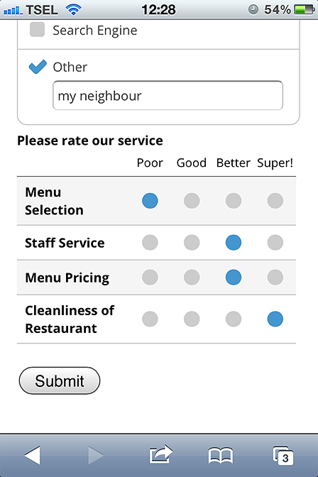
The result of the above form when being viewed through the iPhone is:


Looks fantastic isn’t it? 😉
There is no extra effort needed on your side. All your forms will automatically display mobile-friendly version when being displayed through small devices.
All the fields are being optimized for touch devices. Text fields are having larger sizes, checkboxes and multiple choices are being morphed into bars, form borders being removed to save space, etc.
In short, your forms will looks totally awesome on the desktop or mobile devices! Yay!
Stay tuned for the next feature preview of v3.4, I’m sure you all will love this update 🙂
